
Having been wary, even suspicious of colour, I’m now hooked. I’ve begun exploring how different palettes can be generated and applied. So here are some things that have caught my eye or been recommended – immense thanks to my OCA tutor Cari Morton for the push towards these designers and ‘aesthetic clarity’:
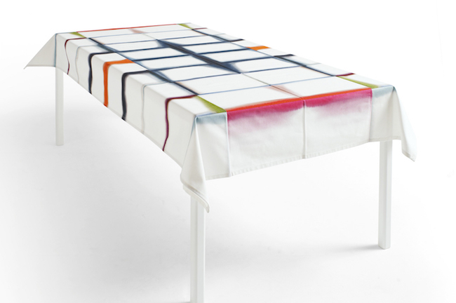
Margrethe Odgaard – Danish textiles designer based on Copenhagen. I’m stunned by the clarity of her colours in these tablecloth pieces, as well as the concept and use of folding:

In my previous course, A Textiles Vocabulary, I had to create my own Colour Book – but, oh, how I wish I’d had sight of this one by Odgaard at the time – she created it by recording colours she saw on journeys around Japan:

The combination of colours in threes is particularly effective – Odgaard explains that for her this refers to ‘the musical chord, a harmonic set of three or more notes that is heard simultaneously’. I think what particularly appeals to me about Odgaard’s work and philosophy is that it its based in craft, sustainability and natural colours yet is fresh and contemporary and free of any compromise that these values sometimes involve. I think I’ve found my role model.
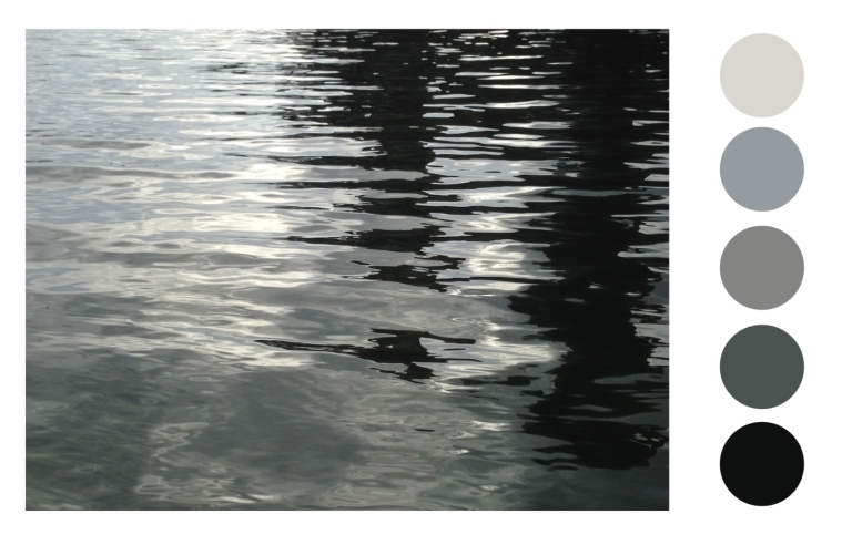
A variation on this is created by Saane Schuurman in her Color Magazine, identifying palettes from the world around her and Google Earth – I was surprised by the use of this as a source. I much prefer the images and palettes created from the natural world on her ColorUse page here. I love photography and during my first course, I hit on the idea of taking colour palettes from some of my photos, digitally:


(Interestingly most of the actual work I produced at this time has none of this crispness and clarity in terms of colour but is all rather muted and even muddy… a bit of a disconnect there). Anyway, it turns out that creating palettes from digital images is not an original idea (surprise) – there are some delightful examples on Schuurman’s website from rather more exotic sources and developed into sample products:
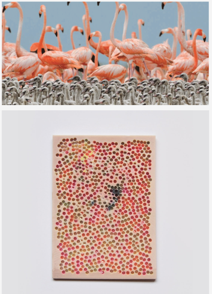
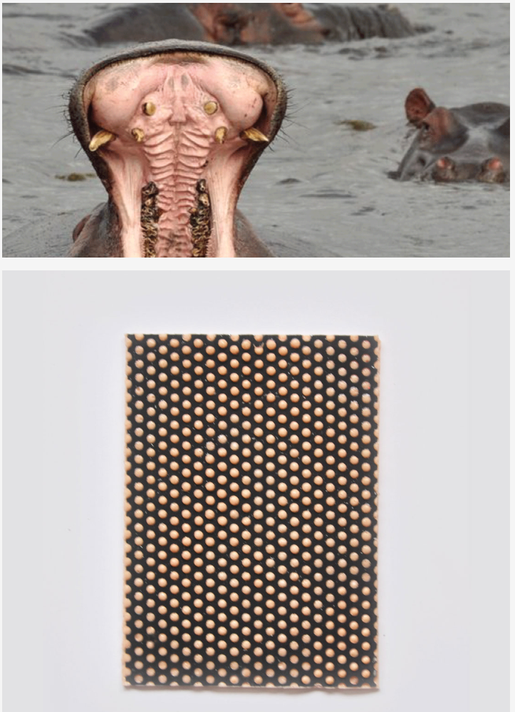
I particularly like Schuurman’s use of colour in plaster, given that it’s my medium of choice at the moment – can anyone tell me how to achieve these lovely clear colours in plaster?
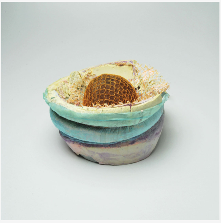
My own colour in plaster is a little more muted and tentative at the moment:


Now I’m working on colour for my new course with the aim of developing what my tutor called ‘aesthetic clarity’ – I’m quite good at finding that when I’m planning a palette, less so once I get involved in the actual making when things get a bit random.
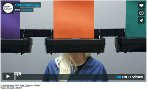
My eye was also caught by this fab installation video on Raw Color’s website – I have been thinking of using video myself – I teach creative media production to sixth formers so I’m immersed in the medium on a day to day basis. But I couldn’t produce anything on quite this level:
According to Pantone’s website, the Color of the Year for 2017 is… Greenery – ‘a fresh and zesty yellow-green shade that evokes the first days of spring when nature’s greens revive, restore and renew’. Their promo video shows why this colour:

Sources
Margarethe Odgaard – all images from her website here [accessed 26-01-17]
Sanne Schuurman – all images from website here [accessed 26-01-17]
Raw Color – a design collective based in Eindhoven website here [accessed 26-1-17]
Pantone website here [accessed 26-1-17]
Other images from my blogs for my OCA courses A Textiles Vocabulary here, and Mixed Media for Textiles here and here

Well, Julie, I haven’t tried cement or plaster (which is has a very high pH I suppose) but I have plans on trying basic pigments (as you get them from old fashioned paintshops). I presume one might also add titanium white to get these sheer pastel colours as at least cement has much of a grey colour. But you say you are using plaster, isn’t that white to begin with? A good challenge though! Good to see how you are firm on the ground with your own ideas. Will there be an I&P blog or is this the one?
LikeLiked by 1 person
Thanks for the thoughts on colour, Inger, my knowledge in this area is sketchy to say the least so your contribution is much appreciated. There will be an IAP blog, yes – I’m going to keep this one for fun and random stuff as opposed to the stuff that’s going to be assessed!
LikeLiked by 1 person
An interesting read! Love the colour palettes of the artist that went round Japan! Followed xx
LikeLike
Thanks. Loving M Odgaard’s work – she is a colour genius.
LikeLiked by 1 person